Why use Tailwind CSS for your Next Frontend project?
10 best useful features you would not miss.

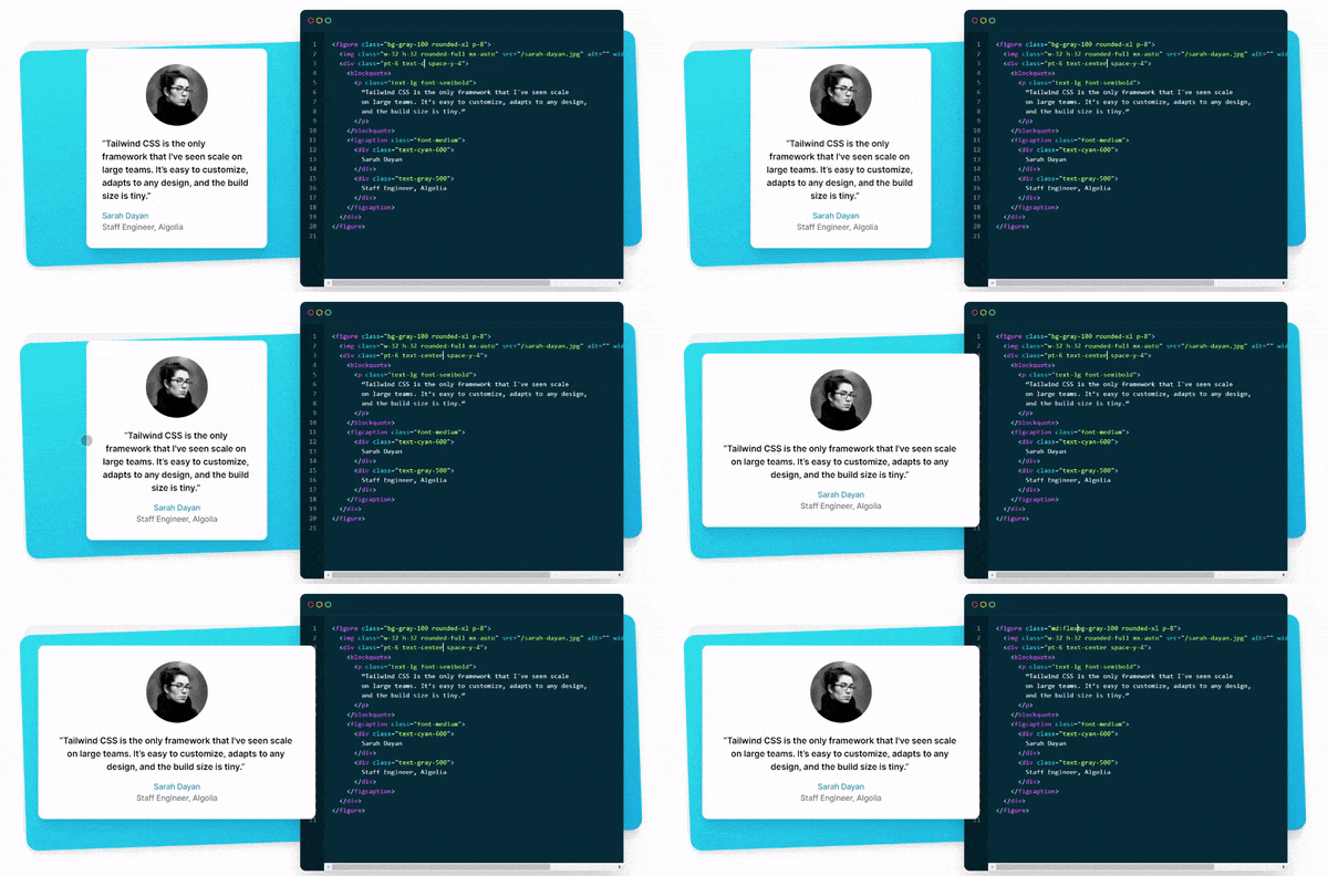
In brief, Tailwind CSS is a utility-first CSS framework that eliminates the need to write traditional CSS classes and get the job done without leaving your HTML. The framework is absolutely incredible with its mobile-first design approach and faster rendering with the ability to Purge.
 |
| Source: tailwindcss.com |
Web development is an ever-growing tech that needs constant learning. With every new framework coming in quite a few months, there is a constant need for a developer to understand the technology at a rapid pace. Speaking of which, rapid is the thing for the future. One of such frameworks is Tailwind CSS, which makes a developer write code much faster using Tailwind's utility classes. Okay, what are utility classes? Utility classes are a set of predefined code that serves its purpose with a call of short-form code, right within html.
Now let's check what are its benefits:
1. Performance ready
Even after you design beautiful-looking websites/apps there is a challenge for frontend developers to optimize their work for production and make them performance-ready. Since Tailwind CSS works on utility-first classes, the production build is absolutely performant eliminating the use of unnecessary classes.
2. Ability to Purge
Tailwind is designed to be component-friendly. It is so much easier to separate a site's elements into smaller components and not pollute the codebase with objects. Enabling the purge option in Tailwind makes tree-shaking unused styles and optimizes the final build size.
3. Mobile-first
The class names you write default to a mobile layout that makes it extremely user-friendly and quite responsive to larger screen devices.
4. Tiny size for production
Tailwind CSS is extremely lightweight, making the production build extremely tiny in size compared to normal CSS with a separate file.
5. Global responsiveness
You get to build websites that are almost native to the device by following the responsiveness all over. The mobile-first strategy of Tailwind makes it even more commendable. By using sm: md: lg: xl: 2xl: breakpoints, it is quite easy to achieve responsiveness based on the device.
6. Hover and Focus states
Worried about the hover and focus states used in traditional CSS? Tailwind has it all covered. By simply adding predefined hover: and focus: states, you can achieve these states easily.
Example:
<button class="bg-red-500 hover:bg-red-700 ...">
  Hover me
</button>
7. JIT mode
Tailwind has introduced JIT(Just in Time) compiler that generates styles on demand instead of generating everything in advance at the initial build time. It significantly improves browser performance even in development as it doesn't have to parse and manage multiple megabytes of pre-generated CSS.
8. Beginner-friendly
Tailwind CSS is extremely easy to learn even for beginners who are not into css before. The short-form classes can be easily remembered and the desired layout can be achieved easily.
9. Highly customizable
Rather than having pre-defined classes made by Tailwind, you can also build your own classes and call them globally anywhere in your pages.
10. Intellisense autosuggestions with VS code
Tailwind Intellisense extension for Visual Studio Code makes it even more flexible to write the code making suggestions a breeze. It is definitely worth trying out.
